Analysis of Active Travel Counts in London
Overview
The first semester at UCL involved quite a bit of data analysis using TfL’s cycling database (quite coincidential). The projects on this page summarises work from my course (and some additional work) involving cycling data analysis.
E-scooter Accident Analysis
I have explored the correlation between the number of accidents and the amount of traffic passing through, showing a weak linear correlation. I have also explored the spatial autocorrelation through local Moran’s I analysis, indicating areas that have a relatively high accident rate compared to the surrounding areas.
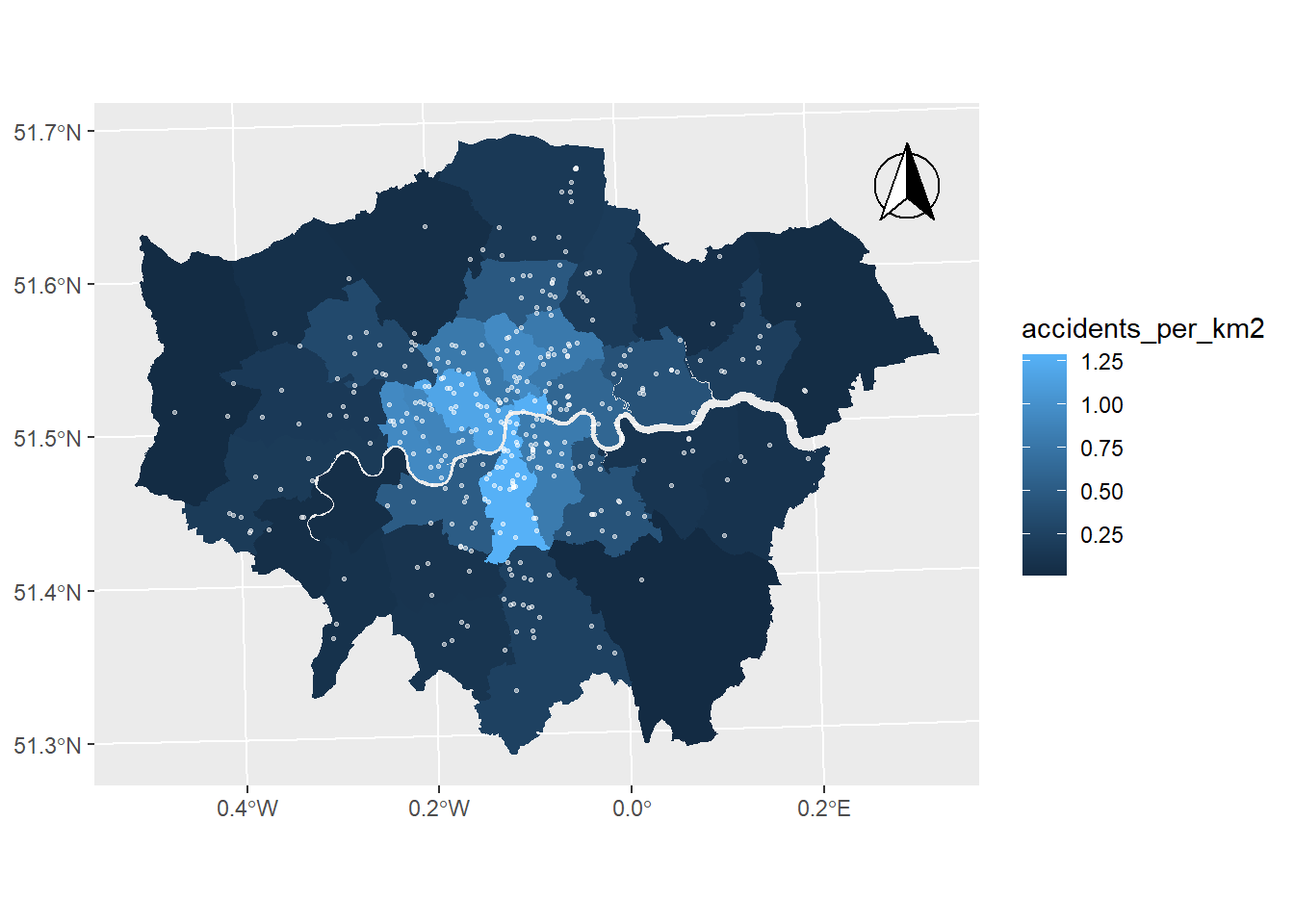
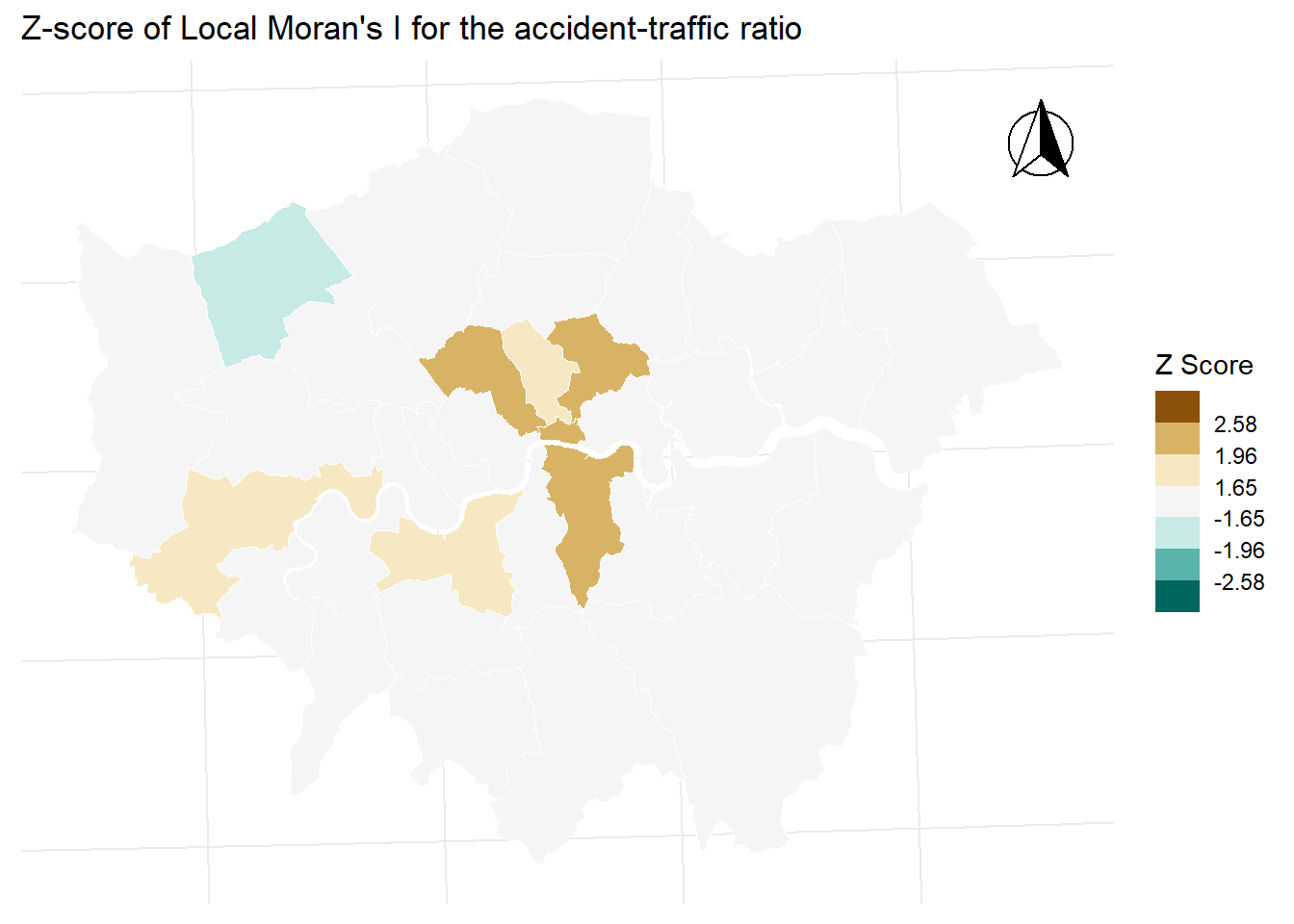
Some interesting trends were observed, indicating areas that may be potentially safer / more dangerous compared to their surrounding boroughs.
The full report can be found here.
This was done as a final assessment for the Geographic Information Systems and Science module conducted by Dr. Andy MacLachlan. Details of the prompt can be found at the GitHub repository.
Active Travel Count Analysis
We have explored the relationship between the active travel counts and various factors of the built environment.

We have explored the following characteristics using multiple regression, returning the results shown.
| Variable | Correlation |
|---|---|
| Zone (Central / Inner / Outer) | Negative correlation (more counts in the centre) |
| Weather (Wet / Dry) | No significant correlation |
| Peak times | Positive correlation |
| Bus lane | No significant correlation |
| Cycle lane | Positive correlation |
| Shared path | No significant correlation |
One interesting point to note is the immunity of Londoners to bad weather when cycling - needs further investigation to confirm.
This was done as a group project as part of the Quantitative Methods module run by Dr. Huanfa Chen.
Group Members
- Qiyue Chen
- Hongkai Ren
- Yilin Yang
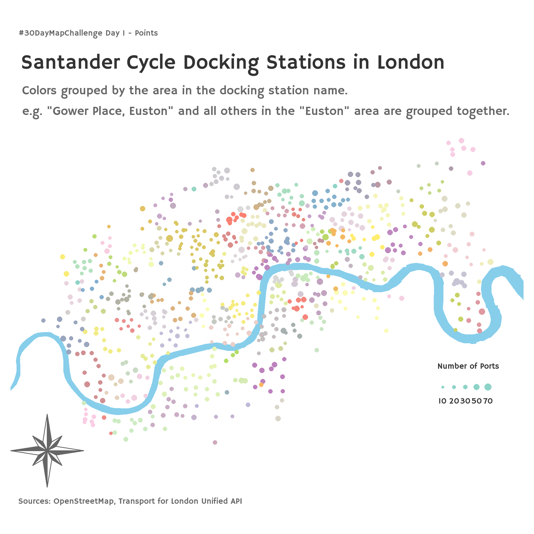
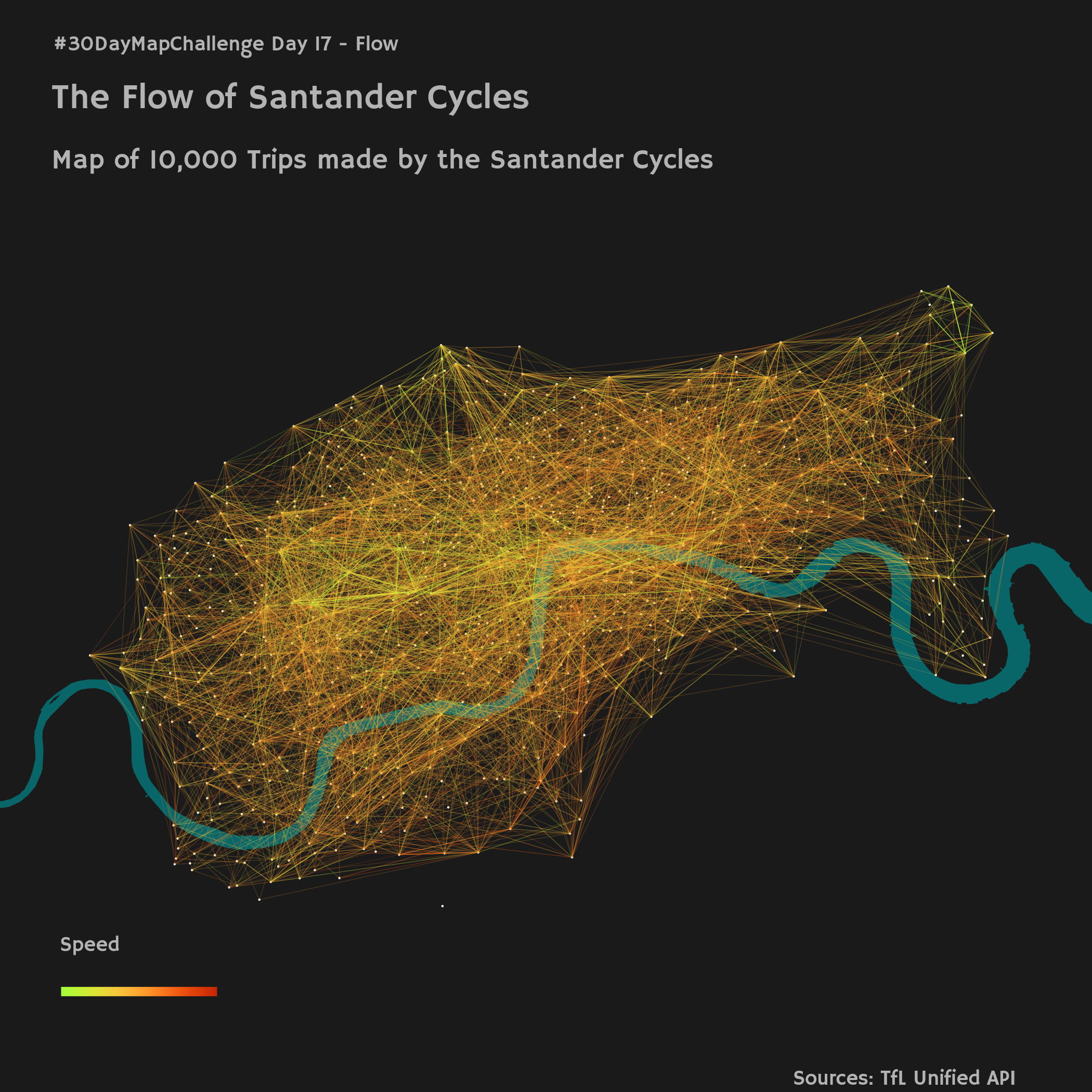
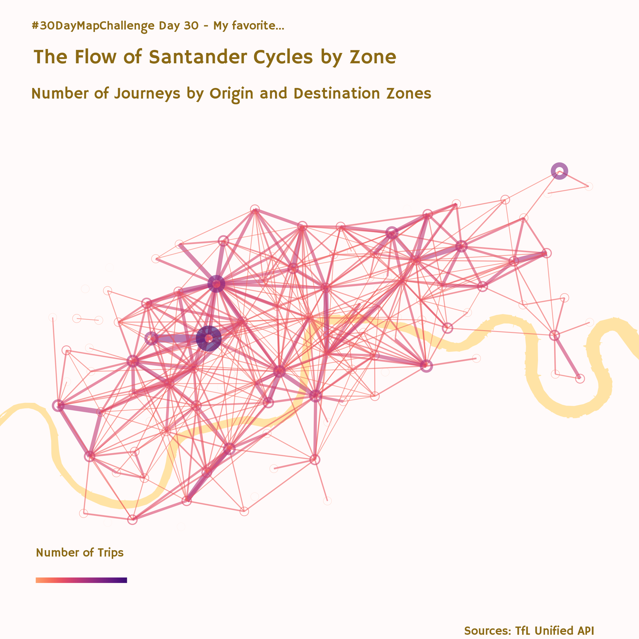
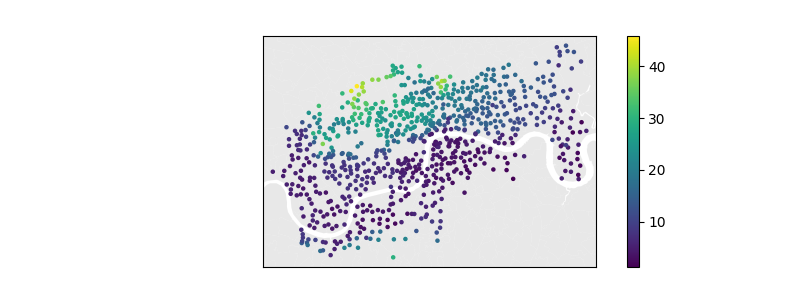
Santander Cycles Usage Data Analysis
The Santander Cycles is the cycle hiring scheme in London, which provides usage data for all journeys taken.
I have explored the relationship of elevation of docking stations and the number of journeys taken, taking away two key findings:
- When focusing on individual docking stations, the higher the elevation the ratio of departures over arrivals was higher, indicating users taking advantage of downhill journeys.
- On the other hand, there was no obvious relationship between the height difference from origin to destination when given focus on each journey
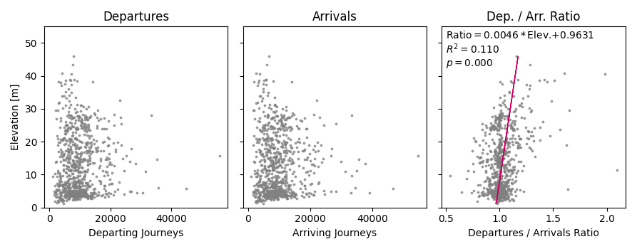
This seemingly contradictory results provide room for further research, making clear the differences within Santander Cycle usages.
The report can be found at the GitHub repository.
Other Visualisations
A few of my maps from the 30-Day Map Challenge 2023 have been based on cycle usage data.