3 Remote Sensing Data Manipulation
3.1 Summary
In order to use the remote sensing data most effectively, data manipulation is desired. This comes in two perspectives: correcting data to remove the impacts from unnecessary factors, and joining and enhansing data.
3.1.1 Data Correction
The raw data fetched from satellites are subject to interference by environmental factors. Data correction is required to correctly analyse the satellite imagery obtained. The following explains the various aspects of data correction.
Thankfully, the contemporary satellite imagery prouducts come in ARD: Analysis Ready Data so I am expecting we don’t need to worry too much about these jargons.
Atmospheric Correction
Removing the effect of atmosphere which absorbs and scatters light, leading to haze (reduced contrast of image) and the adjacency effect (nearby pixels bleeding into each other).
Relative Correction
Relative correction normalises intensities of bands within a single iamge or within multiple dates. The dark object subtraction (DOS) method assumes the darkest value in the image displays the effect of atmosphere, and subtracts that value from the whole image, leaving the actual surface reflectance value. Other methods such as pseudo-invariant features are proposed as well.
While these simple methods can calibrate values within one imagery, the relative nature does not allow for comparison between different imagery - this is where absolute correction comes into play.
Absolute Correction
Calculates the scaled absolute value for surface reflectance, enabling comparison between different places on earth. Multiple models are proposed, or a field work can be conducted to make the satellite observe the empirical line of spectrometer you laid out in the wild.

Geometric Correction
Geometric correction is manipulation to fit the earth observation data into a reference system. This is similar to the process of georeferencing analog maps (Skopyk 2021).
This is achieved by taking several reference points (Ground Control Points) on the imagery where the actual coordinates are known, and interpolating the areas in between (Jensen 2016).
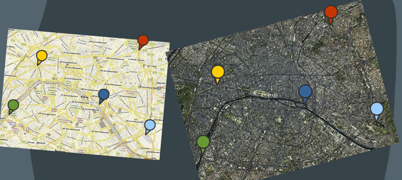
The actual mapping is done backwards, where points on the imagery are calculated from coordinates on the gold standard map, so that every point on the study area has its corresponding point on the imagery. This is modelled as follows.
\[ \begin{cases} x^i = a_0 + a_1x + a_2y+\epsilon_i \\ y^i = b_0 + b_1x + b_2y+\epsilon_i \\ \end{cases} \]
- \((x^i, y^i)\): coordinates on the satellite imagery
- \((x, y)\): coordinates on the gold standard map
Orthorectification or topographic correction is one aspect of this, correcting the image so that it is viewed at nadir. One method is cosine correction, where the radiance is calculated as:
\[ L_H = L_T \frac{\cos \theta_O}{\cos i} \]
- \(L_T\): radiance (TOA) from sloped terrain
- \(\theta_O\): zenith angle of the sun
- \(i\): sun’s incidence angle (angle between rays and normal of surface)
This will be important especially if using imagery from aircrafts flying at relatively low altitude compared to satellites.
Radiometric Calibration
The original satellite imagery stores data using digital numbers (DN) which has no units! This needs to be translated into values with meaningful units.
3.1.2 Data Joining and Enhancement
We do not need to use the data as is, but are open to wrangling data for analysis as well.
Joining
Joining is the procedure of combining separate images from different data sources to cover the whole study area. Also called mosaicking. The algorithm behind this is called a histogram matching algorithm, where the 2 images are given similar brightness values.
Enhancements
Images may be enhanced to improve the appearance or results of analysis.
There are many enhancement methods. One simple method is contrast enhancement where image band not making use of the whole spectrum range are expanded so that the contrast is maximised.
3.1.2.1 Ratio enhancements
The one I found interesting was ratio enhancements, where the manipulation between different bands enabling us to gain insights from the results.
One example of this is the normalised difference vegetation index (NDVI), where a high value indicates healthy vegetation. The calculation is as follows, and I was surprised how simple this value could be calculated!
\[ \text{NDVI} = \frac{\text{NIR}-\text{red}}{\text{NIR}+\text{red}} \]
I have applied this to a dataset from Landsat 8 for southeast England, where I merged 2 datasets to cover a wider area.
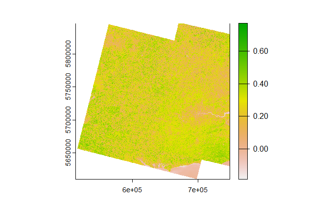
It is interesting to see that you can make out the patch with low value on the right hand side which is Central London, and that you can see the vegetation has a range in its healthiness; if you look at the optical imagery it is hard to tell the differences between healthy and unhealthy vegetation.
Let’s zoom in to the London Borough of Camden - home to two major patches of urban green space: Hampstead Heath and Regent’s Park.
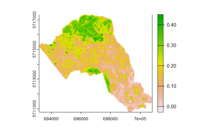
You can easily make out Regent’s Park and Primrose Hill at the bottom left and Hampstead Heath at the top, which are home to the healthiest patches of vegetation in this area. Smaller patches have smaller NDVI value, indicating they are unhealthier compared to that of parks. If you compare the scale to the bigger picture above, you can see that the maximum value is lower in Camden. Understandable, but it is great you can see the difference!
3.1.2.2 Other techniques
Other enhancement techniques covered include the following:
- Filtering sharpens (high-pass) or averages (low-pass) surrounding cells in order to capture particular characteristics
- PCA is a method of dimension reduction, taking multiple bands and combining them into a smaller number of bands.
- Texture considers the difference of values between moving windows, allowing for edges of certain object to be clearer.
I calculated the texture value using the red band for the London Borough of Camden, and the results are shown below:
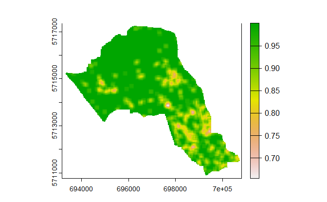
I must admit it is difficult to make out individual differences, but you can see the areas around King’s Cross, St. Pancras and Euston stations having a smaller texture value. It seems to be successfully identifying the different characteristics of urban landscape!
3.1.3 Glossary
There were a lot of new terminology introduced in this session.
3.1.3.1 Data Correction Vocabulary
- nadir: looking straight down, not at an angle.
- zenith: point vertically above observer. Zenith Angle is the angle between object and zenith.
- incident angle: the angle between the normal of the sloped terrain and the sun. If horizontal, this matches the zenith angle.
- azimuth: the compass angle of the sun, measured from the north. Same idea with runway names!
3.1.3.2 Data Enhancement Vocabulary
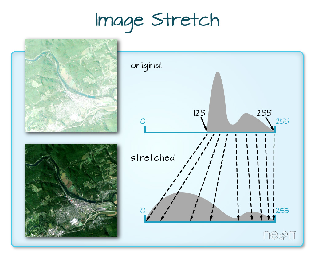
- Image Stretch: expanding the range of bands so that it utilises the whole range of values allowed
- Texture: calculating the value across a certain window and comparing with adjacent values, allowing to identify edges of features
- PCA: a method of dimension reduction
3.2 Applications
I will look at 2 papers that measure the accuracy of image segmentation using different color bands and methodologies.
Trias-Sanz, Stamon, and Louchet (2008) explores the usage of colour bands and textures to identify objects within an image. Using multiple bands, the paper attempts to optimise the best parameter that successfully identifies different objects in an imagery of a rural area. The paper addresses the varying scale of focus in the project, whether to focus on individual trees within a field or the field as a total. It also discusses the multiple ways of data enhancement, and tries to optimise which parameters and transformed channels should be used to achieve the best results for object segmentation.
Kupidura (2019) analysed multiple methods of texture analysis to compare the accuracy of identifying different land cover types. 3 types of texture extraction was considered, the GLCM (Gray Level Co-occurance Matrix), Laplace Filters and Granulometric Analysis. The first two methods seem to be more popular among remote sensing analysis, and a third method which is less known. The results indicate the granulometric analysis is the best methodology in terms of identifying different usages from satellite imagery, although I get the feeling that the authors are trying to promote this methodology that they have been using for previous research, since the merit of the granulometric analysis derives from mitigation of the edge effect, a problem which the two other methods have in common. Maybe comparing different methodologies to overcome the edge effect would have been more persuasive (or, maybe this in itself is quite an achievement. I might need more knowledge in this field to answer that question.)
Both of the papers address the accuracy of image segmentation using many possible index channels, where we try to identify the objects that appear in the satellite imagery. The first paper has a focus on tweaking parameters within a single methodology, while the second paper focuses on choosing the correct method given a remote sensing dataset. The 10-year difference between these papers might have seen a dramatic advance in technology, but I have the impression that trying to make image segmentation as accurate as possible is an essential part of EO data analysis.
3.3 Reflection
Data correction is the first thing we have covered this week, and I cannot believe analysis ready data is provided after all this manipulation. Although I might not do the data correction myself, I should be prepared to understand the differences between the multiple products of satellite imagery, and be able to choose which one I should be using for analysis.
I feel very thankful for the people trying to improve the algorithm behind analyses; which I could not get my head around. The idea of taking multiple bands and adjacent pixels are interesting enough already, and trying to make out different features are wonderful!
After a few weeks, I am starting to understand the variety of things you can do using satellite imagery. I did not have the idea of taking adjacent values and calculate indeces that act as indicators of change among the different datasets, which helps differentiate between objects within the imagery. I am feeling I should deep-dive into the different indeces developed by other researchers, to see what can be highlighted using simple combinations of different bands!